Hoe een achtergrondafbeelding stilletjes uw professionele uitstraling tijdens videovergaderingen versterkt
Uw achtergrond bij videovergaderingen is een onzichtbare professionele visitekaart in de wereld van externe samenwerking. In dit artikel wordt uitgelegd hoe uw keuze voor een achtergrondafbeelding de eerste indruk beïnvloedt, en bieden we praktische richtlijnen voor het selecteren van een geschikte achtergrond, gebaseerd op psychologie en ontwerp.
We besteden vaak een halfuur aan het kiezen van een das, het afstellen van microfoons en het controleren van de verlichting—en toch nemen we vlak voordat we op ‘Video starten’ klikken vaak willekeurig een rommelige hoek van onze woonkamer als achtergrond voor videogesprekken. Nu samenwerken op afstand steeds meer de norm wordt, is de achtergrond voor videogesprekken (video call background) lang niet meer alleen een technische toevoeging, maar een stille, krachtige professionele visitekaart.
Psychologisch onderzoek toont al lang aan dat eerste indrukken binnen minder dan zeven seconden worden gevormd, waarbij visuele informatie tot 93% bijdraagt (APA, 2017). Wanneer collega’s, klanten of sollicitatiegesprekvoerders u door het scherm aankijken, zien ze niet alleen uw gezicht en horen ze uw stemtoon—ze nemen ook uw ‘ruimtelijke persoonlijkheid’ waar: die zorgvuldig bijgesneden, stil aanwezige achtergrond die subtiel orde, esthetisch oordeelsvermogen en professionele volwassenheid uitstraalt.
Achtergrond als context: waarom een zorgvuldig ontworpen achtergrondafbeelding beter is dan een echte omgeving
Veel mensen kiezen standaard voor fysieke ruimtes als achtergrond: boekenplanken, banken, vensterbanken… maar de realiteit zit vol afleidingen: onopgeruimde dekens, weerkaatsing op glasdeuren, plotseling binnendringende huisdieren of familieleden. Zelfs virtuele achtergronden hebben nadelen: wazige randen, renderingproblemen bij haar, bewegingsvervaging — allemaal factoren die de geloofwaardigheid ondermijnen. Een goed ontworpen statische achtergrondafbeelding omzeilt al deze risico’s.
Een gecontroleerd onderzoek van het WallpaperSense-team in samenwerking met het Spatial Cognition Lab van de University of the Arts London toonde aan dat deelnemers die neutraal gekleurde, laag-contrastige textuurachtergronden gebruikten, gemiddeld 28% hoger scoorden op de criteria ‘professionele geloofwaardigheid’ en ‘waargenomen concentratie’ dan deelnemers met een echte omgeving als achtergrond. Wanneer achtergrondafbeeldingen zachte geometrische lijnen of minimalistische natuurlijke motieven bevatten — zoals de silhouetten van door mist gehulde bergen of oppervlakken met een linnenstructuur — ligt hun ‘balans tussen toegankelijkheid en autoriteit’ binnen het ideale bereik: noch kil en afstandelijk, noch te los en ongedwongen.
Achter deze bevindingen schuilt solide designpsychologie: volgens de ‘proxemietheorie’ van milieu-psycholoog Edward T. Hall projecteren mensen instinctief de mate van visuele orde in een achtergrond op de mate waarin de spreker respect toont voor relationele grenzen. Een achtergrond zonder rommel, zonder visuele storingen en met een egaal kleurenpalet communiceert stilletjes: ‘Ik hecht waarde aan dit gesprek — en aan uw tijd en aandacht.’
Drie veelvoorkomende misvattingen die stilletjes uw professionele imago ondermijnen
Misvatting één: ‘Hoe realistischer, hoe geloofwaardiger’ Achtergronden met echte ruimtes worden vaak verward met ‘oprechtheid’, maar onderzoek toont aan dat ongeordende fysieke omgevingen bij kijkers ‘cognitieve belasting’ veroorzaken — het brein moet extra inspanning leveren om visuele rommel te verwerken, waardoor de geheugentrouw van uw gesproken inhoud met 19% daalt (Journal of Environmental Psychology, 2022). Professioneelheid komt niet voort uit ‘realisme’, maar uit ‘gecontroleerd realisme’.
Misvatting twee: ‘Hoe eenvoudiger, hoe veiliger’ Effen witte of grijze achtergronden lijken op het eerste gezicht veilig, maar veroorzaken in werkelijkheid een ‘zwevend’ effect, waardoor uw driedimensionale aanwezigheid en visuele verankering verzwakken. Volgens de kleurtheorie hebben neutrale tinten subtiel tonaal verschil of microstructuur nodig om gezichtscontouren te ondersteunen en visuele aanknopingspunten te versterken. Een effen, detailloze kleurenachtergrond kan u letterlijk ‘doen verdwijnen’ op het scherm.
Misvatting drie: ‘Stijl is volledig persoonlijk’ Diepblauwe sterrenhemels, cyberpunk-stadscapes en handgetekende bosillustraties — deze achtergronden zijn op zich prachtig, maar wanneer stijl en context niet op elkaar zijn afgestemd, ontstaat er een ‘conflict in identiteitssignalen’. Een belastingadviseur die neon-deeltjesanimaties gebruikt, kan onbedoeld de perceptie van stabiliteit ondermijnen; een creatief directeur daarentegen die warme eikenhoutstructuur-achtergronden kiest voor een financieringspitch, versterkt daarmee het beeld van een ‘betrouwbare innovator’.
Hoe kies je een achtergrondafbeelding die echt je professionele imago versterkt?
We raden aan om je keuze op drie dimensies af te stemmen:
1. Kleurtemperatuur × Branchespecifieke context Voor sectoren waar hoge mate van vertrouwen vereist is—zoals financiën, juridische dienstverlening en gezondheidszorg—is het aanbevolen om koelere neutrale tinten (zoals grafietgrijs en celdonwit) te kiezen, gecombineerd met een zachte matglansafwerking. Voor onderwijs, design en consultancy kunnen licht warme grijstinten, havergrijs of lage-verzadigingskleuren zoals aardewerkbruin worden toegevoegd om openheid en warmte over te brengen. Vermijd felrood of fluorescerend groen—deze kleuren activeren het sympathieke zenuwstelsel van de kijker en veroorzaken onbedoeld spanning.
2. Compositieritme × Aandachtsfocus De ideale achtergrondafbeelding volgt de ‘3:7-visuele ademruimteregel’: het gezicht neemt ongeveer 30% van het beeld in beslag, terwijl de achtergrond 70% emotionele ondersteuning biedt. Vermijd strikt centraal uitgelijnde patronen (die oogstijf overkomen) of intens herhalende texturen (die visuele vermoeidheid veroorzaken). Geef de voorkeur aan composities met een horizontale uitstraling—zoals silhouetten van verre bergen of lichte houtnerf in horizontale richting—die subtiel de aandacht naar jouw ooggebied leiden.
3. Materiaalmetafoor × Professionele identiteit Een textuur van gerecycled papierpulp suggereert menselijke diepgang; microcement wekt moderne rationaliteit op; een organische katoen-linnenweefsel benadrukt duurzaamheidswaarden. De ‘materiaaltaal’ van een achtergrondafbeelding is een zachtere, maar krachtiger identiteitsmarker dan elk logo. Elke WallpaperSense-achtergrondafbeelding is duidelijk voorzien van ‘stemmingskeywords’ en ‘geschikte toepassingsgebieden’, bijvoorbeeld «Mistige dennenvorst» met de labels 【Rustig | Strategische vergaderingen | Leidinggevende communicatie】—zodat je exacte afstemming op je gewenste imago kunt realiseren.
Kleine verandering, grote impact: het cumulatief effect van een achtergrondupgrade
Een consultancy uit Tokyo voerde een A/B-test van acht weken uit onder 56 adviseurs: de ene groep bleef standaard virtuele achtergronden gebruiken, terwijl de andere groep overschakelde naar op maat gemaakte, minimaal opvallende wallpapers (lichtgrijze ondergrond met uiterst fijne verticale lijnen). De resultaten toonden aan dat deze laatste groep in nasprekgesprekken met klanten 41% vaker werd omschreven als ‘goed voorbereid’ en ‘helder van denken’. Bovendien verlengden klanten na drie of meer vergaderingen vrijwillig de gespreksduur 2,3 keer zo vaak.
Dit is geen toeval. Wanneer uw achtergrond niet langer om aandacht concurreert, keert de cognitieve belasting volledig terug naar uw boodschap. En wanneer uw visuele omgeving consistente, ingetogen en smaakvolle signalen afgeeft, wordt vertrouwen stilletjes, gestaag en diep opgebouwd.
Voor uw volgende videovergadering: u hebt geen perfecte ruimte nodig — u hebt wel een wallpaper nodig die weet hoe ze ‘storende elementen dempt, de focus versterkt en uw persoonlijkheid onderstreept’. Ze roept niet, maar heeft wel gewicht. Ze spreekt niet, maar spreekt al voor u.
Featured Wallpaper Packs
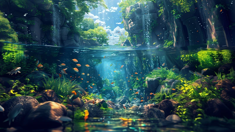
Oriental Art Onderwater Bos en Rivier 4K 8K Ultra HD Wallpaperverzameling
7 rustige Oriental art wallpapers met onderwaterbossen en rivieren in 4K en 8K Ultra HD, geoptimaliseerd voor Desktop, Telefoon en Tablet.
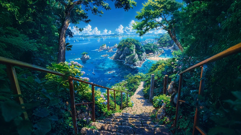
Japanse kusttrap 8K ultra-HD-beeldschermachtergrondverzameling
12 Japanse kustachtige achtergronden met trappen, zeilboten en kustlijnen — in 8K ultra-hoogdefinitie, geoptimaliseerd voor desktop, mobiel en tablet.
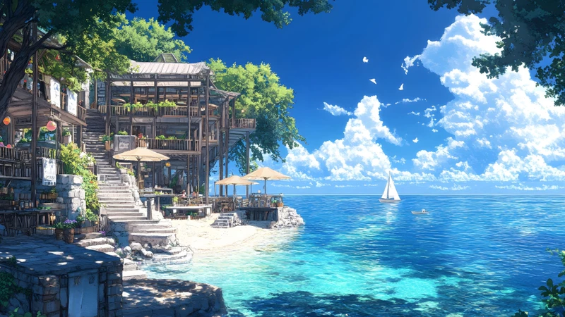
Japanse kustlandschap 8K Ultra HD bureaubladachtergrondpakket
28 Japanse kustachtergronden met strandhuisjes, vuurtorens, drijfhuisjes en boekwinkels op zee — allemaal in 8K Ultra HD, geoptimaliseerd voor bureaubladweergaven.
Related Articles
Van afgeleid naar gefocust in één wallpaperwissel: Hoe minimalistische bloementuinen mijn studiebureau veranderden (en waarom die van jou ook kunnen)
Staart je naar een rommelig bureaublad terwijl je probeert te studeren? We verge...
Waarom je meditatieapp een nachtlandschap van Miyazaki nodig heeft — de stille opkomst van mindful wallpaperontwerp
Steeds meer mensen kiezen bewuste wallpapers niet alleen om schermen te decorere...
Drie Minuten Rust: Hoe een Lunchpauze Wallpaper Kiezen dat Voelt als Binnenstappen in een Chinese Herfstboomgaard
Je hebt 20 minuten. Je ogen zijn moe. Je brein voelt als statisch ruis. Hier is ...