Jaký styl pozadí je vhodný pro různé povolání? Jak vizuální prostředí tichounce zvyšuje pracovní efektivitu
Kognitivní vzory a emoční potřeby se liší podle povolání – to určuje ideální styl pozadí. Tento článek vychází z environmentální psychologie a designové praxe a nabízí vědecky podložené a empatičtí doporučení pro programátory, návrháře, učitele, lékaře a další.
Každý den trávíme více než třetinu času před obrazovkou – návrháři upravují barvy v Photoshopu, programátoři píší kód v terminálech, učitelé se připravují na hodiny v PowerPointu, lékaři prohlížejí elektronické záznamy. Pozadí obrazovky není jen dekorací, ale tichým oknem, které neustále posílá do mozku vizuální signály: rytmus, náladu, pocit uspořádanosti i kognitivní zátěž. Psychologické výzkumy (např. Univerzita Exeter 2019, studie o prostředníkové kognici) ukazují, že vizuální prvky pracovního prostoru výrazně ovlivňují délku koncentrace, úroveň stresu a tvůrčí výsledky. A protože je tapeta nejzákladnějším a nejflexibilnějším vizuálním vrstvou digitálního prostoru, měla by být vybrána s ohledem.
Profese není definována jen názvem pozice, ale hlavně jejími kognitivními vzory, senzorickými potřebami a emocionálním tempem. Například inženýři vyžadující intenzivní logické úvahy často prosperují ve strukturovaném, nízko-zaměřeném vizuálním prostředí; obsahoví tvůrci mohou najít inspiraci v obrazech plných metafor a volného prostoru. Toto není mystika, ale praktický výsledek zkoumání prostředníkové psychologie a neuroestetiky.
Programátoři a analytici dat: Minimalismus × Racionální uspořádání Tyto profese denně zpracovávají velké množství abstraktních symbolů a hierarchických struktur, takže vizuální systém je náchylný ke „kognitivnímu zbytku“ z nepořádných rozhraní. Doporučujeme jednobarevné přechody, nízkokontrastní geometrické sítě nebo tmavě šedé/indigové pozadí s jemným binárním texturou. Vyhněte se reálným scénám nebo vysoko nasyceným barvám – ty neúmyslně soutěží o pozornost, která by měla být věnována logice kódu. Čisté, dýchavé pozadí umožní syntaxovému zvýrazňování v IDE skutečně vystoupit.
Návrháři a tvůrci: Prázdný prostor × Metafora × Texturová hloubka Tvůrčí schopnosti nevznikají z ničeho – spoléhají na „vzdálené asociace“, kdy mozek spojuje zdánlivě nevztahující se obrazy. Měkké osvětlené still-life fotografie, ručně malované abstraktní akvarely nebo omezené přirozené textury (např. eroze dřeva, deště na betonu) mohou v podvědomí poskytnout nestandardní stimulaci. Klíčové je „neúplné pocity“: prázdný prostor by měl převyšovat plný, naznačení více než prohlášení.
Vyučující a psychologové: Teplé neutrální barvy × Životnost × Bezpečná hranice Klaserní prostor i poradenský prostor jsou fyzické, ale obrazovka často slouží jako druhý komunikační prostor. Teplé světle kremové, světlé ovesné nebo jemně mlhavé zelené barvy s mírnými organickými konturami (např. rozhodnuté větve, mraky) přenášejí pocit stability, přijetí a nekritického prostředí. Výzkum (Journal of Environmental Psychology, 2021) ukazuje, že tyto vizuální prvky snižují základní hladinu kortizolu u obou stran dialogu, což je zvláště užitečné pro budování důvěry.
Lékaři a právníci: Stabilní zdrženlivost × Přesné detaily × Vizuální opora Vysoce intenzivní rozhodování a pečlivé čtení textu vyžaduje vysokou vizuální stabilitu. Doporučujeme mikroskopické reálné scény: např. část rozložené staré knihy, buňková membrána pod mikroskopem nebo symetrický klasický architektonický pohled. Tyto obrázky mají „fokusovatelné detaily“, které v únavě poskytnou krátký a bezpečný vizuální bod, aby nedošlo k neúčelnému prohlížení – to je efektivní mikrostrategie proti rozptylu pozornosti.
Freelancéři a dálkoví zaměstnanci: Přirozený rytmus × Nahrazení prostoru Dlouhodobé odstoupení od fyzické pracovní prostředí může vést k „prostorovému tupení“ (spatial blunting): mozek ztrácí orientaci v prostoru a časové referenční body. V tomto případě je panorama přirozeného prostředí – např. ranní světlo pronikající mezi bambusem, pole odrážející oblaka nebo cesta vedoucí do mlhy – nejen estetický výběr, ale i vizuální kalibrátor fyziologického rytmu. Změny světla, poloha obzoru, hustota vegetace – všechno to tichounce znovu nastavuje vaše vnímání denního cyklu.
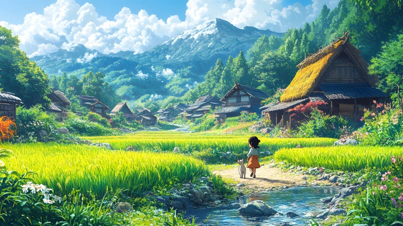
Navrhujeme: Pokud hledáte kombinaci klidu a východní filozofie v přirozeném prostředí, zvažte balíček tapet "Japanese Countryside Landscape 8K Wallpaper Pack". Obsahuje 10 obrázků ve 8K kvalitě z japonského venkova – ne nejsilnější, ale záhyb pšeničného pole ve větru, poměr střešního okraje a světla, stín stromu na mokrém kameni. 5 vertikálních obrázků je vhodných pro mobilní zámek, 5 horizontálních pro plochu. Všechny obrázky byly profesionálně vyrovnány a optimalizovány pro OLED a IPS displeje, aby vytvořily mírný, neoslepivý, terapeutický efekt. Tento „dechující klid“ odpovídá dvěma požadavkům dálkových znalostních pracovníků: stabilnímu prostředí a duševnímu prostoru.
Na závěr: Výběr tapety není jednorázový, typologický přístup. Stav člověka se mění podle projektového cyklu, sezóny nebo dokonce kvality spánku. Doporučujeme aktualizovat si každé čtvrtletí kolekci tapet – a samotný proces výměny uvažovat jako malý rituál: zavřete všechny okna, poprvé se nadechněte, vyberte obrázek, který vám teď nejvíce uvolní ramena. Skutečná profesionalita začíná v okamžiku, kdy se váš vlastní, aktuální požadavek upřímně posloucháte.
Related Articles
Můj trik s dvouobrazovkovým systémem: Jak si dělám desktopové pozadí jako lesní dovolenou — klidné, sjednocené a opravdu pěkné na pohled
Jako dálkový pracovník, který celý den sleduje dvě obrazovky, přestal jsem brát ...
Jak dám svému pracovnímu stolu dýchat s ročními obdobími — a proč mé anime vesnické chaty vypadají jako návrat domů, bez ohledu na měsíc
Jako dálkový pracovník, který změnil roční období (a obrazovky) osm let, jsem zj...
Tvůj laptop se cítí jako stlačovací koule? Změňte to na klidný podzimní balíček pozadí za méně než 5 minut
Zvládáte řadu hovorů a obrazovka vypadá chaoticky. Tento návod trvající 5 minut ...