枫韵山息:中式水墨壁纸如何让思绪如峰顶薄雾般升起
困在创意瓶颈?不是你的方法问题,而是你的像素。了解如何通过有意选择壁纸——特别是像[中式枫叶与山景8K超高清壁纸套装](/packs/chinese-style-maple-leaves-mountain-landscape-8k-caa949fd)这样的宁静、分层画面——可以微妙改变心理状态,提升视觉思维能力,并在无需强迫的情况下自然引出灵感。
你今天第三次打开Figma,却还没画出任何草图。不是卡住了,而是你的屏幕像拥挤的地铁站台:视觉信息太多,大脑无处安放。
这不是你的自律问题,也不是工作流程的问题,而是你工具背后的那张壁纸——每当你做决定时,它都在默默扮演一个无声的角色。大多数人选壁纸只看颜值:日落、渐变色、喜欢的乐队标志。但没有意图的美就像在飓风中点蜡烛——摇曳几下就熄灭了。真正的创意燃料不会喧哗,它沉静、呼吸,等待的不是关注,而是共鸣。
正因如此,那些持续产出新点子的设计师、作家和开发者从不满足于‘好看’的像素。他们懂得营造‘认知空间’。而其中最安静有力的工具之一,就是东方美学构图——尤其是融合枫叶、薄雾山峦与梅花的水墨风景。这就像你在拿起乐器前,先选好工作室的声学环境。
为什么‘好看’的壁纸很少激发真实创造力
很多人搞错了关键:创造力不是被刺激点燃的,而是通过‘减法’解锁的——不是空白,而是有意识地删减。一张东京夜景照片或许惊艳,但它高对比度、饱和霓虹和混乱几何会不断迫使你的视觉皮层做出微决策:那个标志看得清吗?那是哪栋楼?为什么那盏灯这么亮?每个小判断都在消耗认知带宽——而这正是你用来构建隐喻、匹配模式和跳跃思维所需的资源。
这就像站在打桩机旁边听耳语。问题不在音量,而在信噪比。‘好看’的壁纸往往信号弱(缺乏清晰节奏或停顿点),噪声强(纹理杂乱、焦点冲突、颜色突兀)。这种组合会耗尽发散性思维——那种让你把樱花联想到界面过渡、把山层联想到信息架构的能力。
极简也不总是答案。纯灰背景虽然减少干扰,但毫无视觉支撑——没有深度暗示,没有舒缓节奏,也没有叙事引导。你的大脑不会放松,只会闲置。你需要一点点视觉语言来稳住心神,这样你的思绪才能从某个地方出发,而不是陷入虚无。
这时东方美学就显现出独特价值——它不是装饰,而是设计伙伴。它不抢戏,反而为你留出空间。
设计师真正需要的壁纸是什么?(提示:不只是‘平静’)
平静只是副产品,不是目标。设计师真正需要的是三点:视觉呼吸感、微妙的故事钩子,以及与UI色彩和谐统一。
- 视觉呼吸感:这不是空无一物,而是有意安排的节奏。就像乐句间的停顿,或者段落中的留白。一层层淡入的雾中山脉,给眼睛自然休息路径——不是因为它是空的,而是因为它层次分明、过渡柔和。你的目光缓缓移动,而非急促扫视。
- 微妙的故事钩子:这是邀请想象,而非指令解读。一片枫叶飘过浅色天空,并不讲一个完整故事,而是暗示一种可能:季节更替、短暂之美、轻柔运动。你的大脑自动补全细节——把这片落叶和用户引导流程联系起来,或是联想到交互设计中的优雅退出。
- 与UI色彩协调一致:如果你的设计工具用冷蓝和干净白,而壁纸是暖橙色调,就会产生轻微视觉摩擦——就像一天穿了不太配的袜子。你不会立刻察觉,但注意力更容易疲劳。东方水墨调色盘——柔和灰、哑光靛蓝、温暖米色、半透明青瓷或梅红——能无缝融入现代界面。它们不冲突,而是衬托,如同美术馆里中性背景让作品自己说话。
对比很重要——但不是那种刺眼的对比。就像字体选择:高对比字体(粗体无衬线)吸引注意;低对比墨笔线条则引发沉思。节奏同样重要:重复形态——比如层层山脊或飘落花瓣——形成视觉节拍,大脑像跟着节拍器一样思考。还有隐含的纵深感?那是大脑的悄悄提示:这里不止表面看到的,慢慢探索吧。
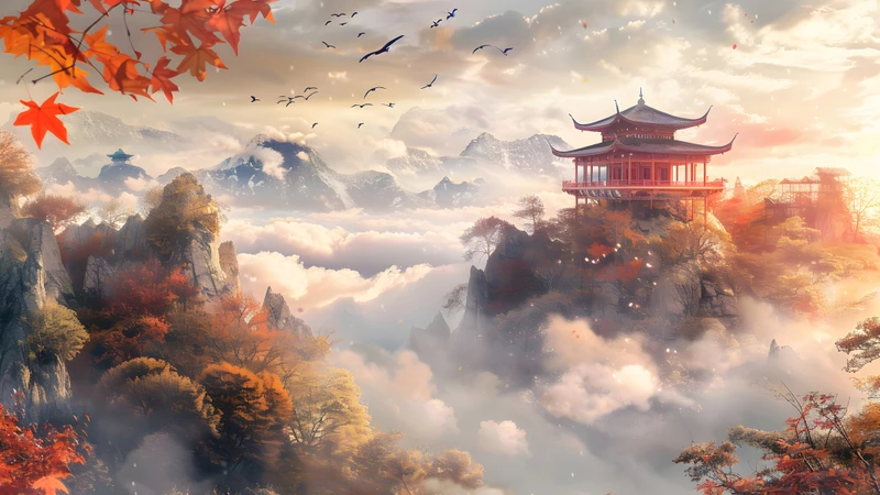
东方构图的静默力量:枫叶、薄雾与群山如何训练你的视线
东方构图不填满画面,而是邀请进入。核心在于‘留白’:有意保留未着墨的空间——不是缺失,而是主动存在。在中国水墨画中,雾不仅是氛围,更是感知的暂停键。它说:这里是你的眼睛可以停留的地方,也是心灵跟上的时刻。这种空白不是虚空,而是肥沃土壤。
这就像对话中的沉默。恰当的停顿不代表说完,而是为你腾出空间去回应、反思或重构。留白在桌面上也起同样作用。当壁纸呈现雾气消散于远方,或是一根树枝映在柔和天空上,你的大脑不再费力解析模糊——它反而靠近,建立连接,发现关系。这就是联想思维发生的地方。
季节元素加深这种效果。枫叶不只是红色——它是秋天,承载着转变、释放与层层变化的联想。梅花在寒冬末期绽放——脆弱、坚韧、充满希望,唤起韧性与宁静开端的感觉。樱花瓣缓缓飘落,不是混乱,而是缓慢交错的弧线——正如想法浮现的方式:不是闪电般的灵光,而是温柔积累。
这类似于气味触发记忆:这些意象不是符号,而是情绪锚点。你的大脑将它们与耐心、无常、平衡等感受相连。这些情绪悄然塑造你的创作姿态。当你背景轻声细语‘让它自然展开’时,你就不太可能强行解决问题。
这不是被动装饰,而是视觉训练。久而久之,你的眼睛学会读懂细腻——在重复中找到节奏,在渐变中看见深度,在克制中体会意义。这种敏感度直接迁移至工作中:你会更快识别布局层级,察觉色彩系统的失衡,直觉理解交互流动——因为你的边缘视野一直在练习。
实用搭配:根据创作阶段选择合适的壁纸能量
并非每个创作时刻都需要相同的视觉能量。你的壁纸应该随意图变化,而不是像默认壁纸那样一成不变。
当你处于构思阶段,选择雾气笼罩的山峰或广阔朦胧的地平线。这类场景提供开阔负空间和柔和过渡——非常适合开放性思考。缺乏硬边界鼓励模糊性,帮助你同时容纳多种可能性。8K分辨率下,墨迹细微颗粒带来触感温度,却不造成视觉杂乱——支持长时间专注而不疲惫。
进入打磨阶段,换成更清晰的画面:古典庭院配上干净石线,或是一枝梅花孤悬于淡蓝天空。它们提供温和结构——不是僵化规则——引导精准操作又不失细腻。清晰度有助于编辑决策:对齐、间距、对比。此时4K分辨率通常刚好合适:足够锐利看清细节,又不至于反光刺眼。
当你需要情绪重启或灵感火花,试试漂浮的樱花瓣或中途飘落的枫叶。它们不是背景,而是微型故事。它们的运动暗示时间、顺序、因果关系。尤其适合写文案前、规划用户旅程或设计微交互之前。轻柔下落呼应滚动、加载或状态切换的节奏。
分辨率远比你想的更重要。8K不是单纯更多像素,而是质感还原度。在水墨场景中,8K展现最细微的笔触差异、最柔和的边缘过渡、最精致的多层雾气透明度。这种精度让你潜意识相信这张图是精心制作的——不是通用模板。当环境感觉被用心打造,你也更愿意以同样的态度对待自己的工作。
中式枫叶与山景8K超高清壁纸套装正是围绕这一节奏设计:14张桌面横版场景用于深度专注,6张竖屏手机版本便于随时反思,每张图都经过调校,只为支持而非打扰创作行为。你会找到《东方枫韵》,落叶沿着柔和宣纸色调划出温柔斜线;还有《山居梅影》,墨色渐变融进寂静空白,邀请你把下一个想法投射到雾中。
困在创意瓶颈?不是你的方法问题,而是你的像素。了解如何通过有意选择壁纸——特别是像中式枫叶与山景8K超高清壁纸套装这样的宁静、分层画面——可以微妙改变心理状态,提升视觉思维能力,并在无需强迫的情况下自然引出灵感。
如果你好奇其他视觉语言如何支持不同创作心境——从动感线条艺术到生物友好渐变——浏览壁纸时按意图筛选,而非仅凭美感。因为你的屏幕不只是工作场所,更是下一个灵感开始聚集的地方——就像峰顶晨雾般悄然酝酿。
Recommended Wallpaper Packs
Related Articles
你的屏幕是压力触发器——动漫风景壁纸60秒内安抚神经系统
整天盯着屏幕?了解精心挑选的自然壁纸——尤其是柔焦动漫风景——如何减轻精神疲劳、缓解眼疲劳,并温和重置神经系统。无需应用,无需计时,只需一次明智更换。
三步放松:如何选择像宫崎骏世界一样的治愈系壁纸
连续开完Zoom会议后关上电脑——屏幕却仍像待办事项列表的延伸。这份三步指南教你如何选出能传达安全感、柔软感和静谧感的放松壁纸,就像走进[日式风景8K壁纸包](...
枫叶、玫瑰与晨间倦怠:4步教你用东方壁纸匹配能量状态
上午10点就感到疲惫?你的壁纸可能正在拖后腿。这份逐步指南教远程工作者如何有意识地选择东方风格壁纸(如枫叶和玫瑰),匹配自身自然能量节奏,获得更平静的专注和更温...