你的屏幕是压力触发器——动漫风景壁纸60秒内安抚神经系统
整天盯着屏幕?了解精心挑选的自然壁纸——尤其是柔焦动漫风景——如何减轻精神疲劳、缓解眼疲劳,并温和重置神经系统。无需应用,无需计时,只需一次明智更换。
你刚结束第三场连续的视频会议。肩膀僵硬,眼睛干涩,桌面背景——那座锐利、高对比度的城市天际线——突然像另一个注意力要求一样压在你心头。
大多数人误解了这一点:你的壁纸不是中性的,它不只是装饰。每次你从文档中抬头、切换标签页,或神经系统暂停重启时(每小时数十次),它都是大脑最先处理的视觉输入。这就像咖啡馆里的环境音:你不会注意到嗡鸣,直到它停止或改变。但和声音不同的是,屏幕的视觉区域永远不会淡出背景——它始终处于“开启”状态,持续向你提出要求。
那座城市天际线?它的尖锐轮廓、饱和霓虹灯和深黑阴影不只是大胆——它们在生物学上很吵。你的视觉皮层把它解读为需要解码的复杂信息,杏仁核将其视为轻微环境紧张,自主神经系统随之反应——微妙却可测量地增加肌肉张力、呼吸变浅,并小幅提升皮质醇水平。你不会感到恐慌,而是疲惫、烦躁,或者那种‘既清醒又累’的模糊感觉。
为什么默认壁纸悄悄让你紧张
你的默认壁纸——无论是山脉照片、品牌图像,还是最爱乐队海报——很可能是因为美观而被选中,而非生理影响。问题就在这里:为美设计 ≠ 为平静设计。
把你的神经系统想象成一个恒温器,用来维持平衡。每个视觉刺激都会轻轻拨动这个旋钮——有些往上(唤醒),有些往下(舒缓)。高对比边缘、快速色彩变化(比如红到黑渐变)、杂乱纹理(砖墙、像素人群)或情绪强烈的主题(暴风雨、强烈肖像)都代表信息密度。即使你不刻意看,大脑也会把这种密度当作工作量。
这类似于荧光灯让房间显得紧张,即使你没盯着天花板看。你的周边视觉捕捉到闪烁和眩光,身体反应比意识更快。一张杂乱或情绪“响亮”的壁纸也是一样:它让视觉处理系统一直处于低强度警戒状态。一天八小时下来,这些微小压力累积起来,就像从未关闭的后台通知。
讽刺的是,许多默认自然壁纸也会引发这种反应。一幅超现实雨林图景,藤蔓缠绕、光影混乱、多种绿色交织,并不传递安全信号,而是暗示觅食、警觉、导航。你的大脑进化出来就是为了识别密集植被作为需穿越地形,而不是休息的地方。
什么样的自然壁纸才是真正让人放松的(不只是好看)
真正让人放松的自然壁纸不在于写实,而在于共鸣——它是否贴近神经系统数千年来的安全、静止与恢复线索。
三种特质能区分真正舒缓的自然壁纸和仅仅悦目的作品:
- 柔和边缘:硬线条(建筑角落、山峰尖顶、清晰文字叠加)会激活大脑的边缘检测电路——也就是扫描捕食者或障碍物的那个系统。柔焦、轻柔模糊的地平线和扩散光晕告诉你的视觉皮层:“这里不需要紧急关注。”
- 和谐色彩节奏:这意味着颜色如呼吸般流动——不是像警报那样对比强烈。比如海洋蓝融化进雾灰色,暖米色过渡到柔和鼠尾草绿,桃粉融入薰衣草黄昏。这不是随意配色;它们呼应了你昼夜节律系统认出的休息型自然光线变化。冲突色(电光绿配热粉色)或突兀饱和跳跃会造成视觉摩擦——就像听到两件乐器略微走调。
- 温和的空间深度:真正的宁静来自你可以“吸进去”的空间,而不是必须“穿越”的空间。有层次但不拥挤的画面——远处山丘、中景树木、前景草地——营造出踏实的开阔感。就像站在安静湖边:目光可以轻松跨越距离,无需聚焦任何一点。相反,扁平或过度压缩的画面(一棵树居中无地平线)会让人视觉压抑——就像盯着一面墙。
很多人犯的错误是:戏剧化的自然场景——海浪拍岸、悬崖上的雷暴、燃烧般的日落——确实情感动人,但生理上是激活型的。它们提升肾上腺素,而非催产素。要缓解压力,你需要的是长呼气的视觉版本,而不是惊呼。
这也是为什么动漫风格的风景往往比写实图片更适合日常平静。它们有意的柔和、精心安排的颜色和谐以及梦幻般的纵深不是风格选择,而是神经捷径。吉卜力工作室并非因为看起来漂亮才画出温柔草地;他们画出来是因为那种感觉就是解脱。
如何30秒内测试任意壁纸——甚至不用设为桌面
你不需要实验室或心率监测仪。只需用眨眼反射、呼吸节奏和周边视觉,在不到半分钟内评估一张壁纸的安抚能力。
首先做眨眼呼吸测试:打开图片全屏。闭眼,缓慢深吸一口气(数到四),再缓缓呼出(数到六)。现在睁眼,不要盯着特定内容,让视线变得柔软、模糊,就像刚醒来一样。注意:胸口是否放松?下巴是否松弛?还是立刻想集中注意力去“搞懂”画面?
接着检查视觉重心:你的目光落在哪里,并且停留多久?一张让人放松的壁纸会让眼睛慢慢漂浮,像落叶随水漂流。一张令人紧张的则会迅速拉住焦点(明亮窗户、鲜明阴影、孤零人物),制造细微心理压力。如果眼睛到处跳动,说明这张图要求太多。
最后缩小到缩略图视图(按 Cmd+Minus 或 Ctrl+Minus 直到只有屏幕10%大小)。去掉细节后,纯构图显现。缩略图是否平衡且宁静?还是晃动、倾斜或失衡?你的周边视觉比全屏更诚实——这是大脑最初判断环境安全的方式。
这不是主观偏好,而是生物反馈。你的身体知道什么是平静,远早于你的大脑命名它。
你的办公桌不是中立的——如何根据工作节奏匹配壁纸氛围
你的桌面不是静态的。它是内在状态与外部需求之间的动态界面——应该随着你一起变化,就像灯光或音乐那样。
把你的工作日想象成潮汐:早晨能量上升,中午达到高峰,下午逐渐回落,晚上温和退去。你的壁纸可以支持每个阶段——不是分散注意力,而是支撑神经系统自然节奏。
- 早晨(8–11点):选择光照充足、温和唤醒的场景——比如晨雾中的稻田,或洒满晨光的高山草甸。它们不是昏沉的,而是清醒却不匆忙。温暖与清晰传递安全感和准备感,就像春日清晨走出户外。它们激发专注而不带来压力。
- 午后倦怠期(2–4点):这时思维摩擦加剧——想法停滞、决策沉重、眼神呆滞。换成雾气弥漫的湖畔咖啡馆、安静海岸小径或森林空地笼罩在柔和薄雾中。这些画面提供视觉柔软度——低对比、柔和色调、水平线条——降低认知负荷。就像给大脑按下90秒暂停键,伪装成风景。
- 下班过渡期(5–7点):你的屏幕不该喊“还在工作!”换上暖色调场景——比如黄金时刻的海边咖啡馆、灯笼照亮的村庄小路,或安静港湾码头。它们起到心理收尾作用,提示结束。柔和光芒模仿日落光线,引导你的昼夜节律系统知道工作已完成。无需关掉电脑,只需让壁纸轻声说:“你现在可以离开啦。”
这不是审美问题,而是有意识的环境设计。你的桌面是你生活中最常看到的表面——比墙壁、桌子甚至咖啡杯都多。把它当作被动背景,是一种浪费的强大机会。
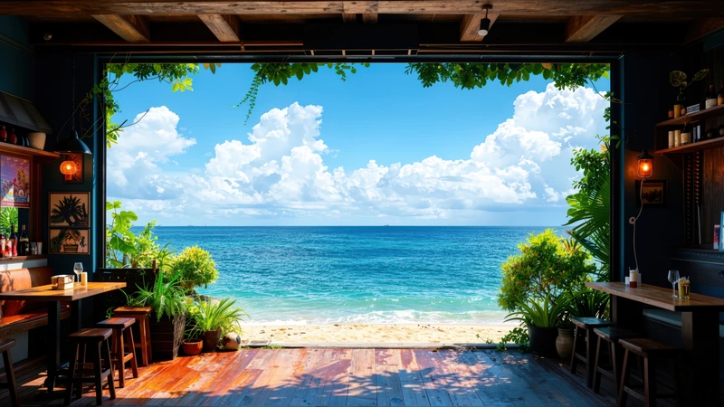
动漫风景4K桌面壁纸包正是为此而设计。包含17幅场景:日本稻田、湖畔咖啡馆、高山草甸、山间村落、热带海滩和幻想山谷——避免视觉噪音的同时保留情感细腻。每张图采用柔焦渲染和精心调校的配色(无突兀对比,无强行戏剧性),让你的神经系统得以安定,而非扫描。它们不是逃避,而是锚点。
你不需要彻底更换整个设置。从一次替换开始。挑一张让你一看到肩部就自然放松的画面,设为壁纸。深呼吸,眨眨眼,感受差异——不是几分钟,而是几秒钟。
因为有个安静的事实:你的屏幕不必成为压力触发器。用合适的视觉语言,它可以变成你最容易获取、随时可用的平静工具——无需应用、无需订阅、无需额外屏幕时间。只要一个决定,一次选择,就能悄然重塑你神经系统度过每一天的方式。
Recommended Wallpaper Packs
Related Articles
枫韵山息:中式水墨壁纸如何让思绪如峰顶薄雾般升起
困在创意瓶颈?不是你的方法问题,而是你的像素。了解如何通过有意选择壁纸——特别是像[中式枫叶与山景8K超高清壁纸套装](/packs/chinese-style...
三步放松:如何选择像宫崎骏世界一样的治愈系壁纸
连续开完Zoom会议后关上电脑——屏幕却仍像待办事项列表的延伸。这份三步指南教你如何选出能传达安全感、柔软感和静谧感的放松壁纸,就像走进[日式风景8K壁纸包](...
枫叶、玫瑰与晨间倦怠:4步教你用东方壁纸匹配能量状态
上午10点就感到疲惫?你的壁纸可能正在拖后腿。这份逐步指南教远程工作者如何有意识地选择东方风格壁纸(如枫叶和玫瑰),匹配自身自然能量节奏,获得更平静的专注和更温...