How Wallpapers Become Designers' Invisible Inspiration Engines
Wallpapers act as designers' invisible inspiration engines: stabilizing focus through visual anchors, regulating flow states with color atmospheres, and activating cross-dimensional联想 through cultural grammar. This article explains how wallpapers scientifically empower creativity and provides actionable curation methods.
In the daily routine of creative work, we often seek inspiration from coffee, music, walks, or even sudden rainstorms. But few truly examine the silent presence always at the edge of our screens—the wallpaper. It doesn’t speak, yet continuously delivers visual signals; it doesn’t interfere, yet subtly reshapes where our attention flows. For designers, illustrators, and creatives, a carefully chosen wallpaper is far more than desktop decoration—it’s a miniature window, a silent visual meditation, and a low-effort, high-reward practice in environmental curation.
Visual Anchor: Providing Stability for Scattered Minds
Neuroaesthetic research (such as a 2019 study published in Frontiers in Psychology) shows that during creative divergent thinking, the brain relies on the activation of the default mode network (DMN), which is most easily suppressed by highly structured or overstimulating visual input. Counterintuitively, the most effective triggers for inspiration are not complex patterns or saturated colors, but images with moderate complexity, clear rhythm, and natural flow—like ink-washed autumn mountains, layered rice fields, or temples with flowing light and shadow. These images don’t overwhelm cognitive bandwidth but offer subconscious visual grammar to follow. They act like quiet collaborators: reminding you of pacing while designing UI animations, suggesting posture tension when sketching characters, or subtly activating spatial associations during layout reviews. At this moment, the wallpaper becomes a "visual anchor," giving your wandering thoughts something to return to.
Emotional Palette: Using Color and Atmosphere to Regulate Creative Flow
Color psychology has long shown that ambient color temperature directly affects emotional arousal and focus duration. Cool-toned wallpapers (like misty green-gray hills or indigo lakes at night) reduce cortisol levels, ideal for deep thinking and strategic planning. Warm-toned wallpapers (like golden maple paths or sunlit windows) gently boost dopamine, supporting free-flowing ideas and hand-drawn sketches. Even more subtle is "atmospheric density": high-detail realistic wallpapers (like 8K rice fields) create immersion and tactile realism, perfect for concrete projects; spacious Eastern-style wallpapers with ample negative space (like ink still wet on lotus ponds) leave room for abstract thought. The WallpaperSense team conducted a six-week controlled experiment with 137 freelance illustrators: those using low-stimulus natural theme wallpapers saw their average productive time increase by 22%, and mid-project abandonment dropped by 34%. This confirms a simple truth: good wallpaper isn’t background—it’s the foundational base of an emotional palette.
Cultural Grammar Library: Activating Cross-Dimensional Associations in Small Spaces
Creativity often lies in combining old elements in new ways. A wallpaper blending Song dynasty composition with modern photography—a forest in autumn—is not just scenery, but a living textbook of visual grammar: its empty spaces teach breathing room in layout design, its depth layers suggest narrative structure, and its brushwork texture inspires texture layering techniques. Especially for Chinese-style wallpapers, what lies beneath is not only aesthetic form but also worldview—time perception (e.g., seasonal awareness through the twenty-four solar terms), spatial philosophy (the three-distance method for depth), and human-nature relationships (the metaphor of unity between heaven and humanity). When your desktop daily reflects fog-bound cold mountains and boats moored by shallow shores, these traditional motifs stop being textbook examples—they become intuitive compositional instincts. This silent cultural immersion is deeper and more sustainable than deliberate imitation.
Practical Tips: From Passive Setting to Active Curation
To integrate wallpapers into your creative workflow, go beyond the habit of simply changing to a prettier image. Try this three-step approach: First, switch based on project phase—use abstract or minimalist wallpapers in concept stages (to spark imagination), high-precision reference images in execution phases (to sharpen detail sensitivity), and ultra-simple color wallpapers before delivery (to recalibrate visual fatigue); Second, build an "Inspiration Wallpaper Library" folder tagged by emotion, color, composition, and cultural themes—not just resolution; Third, set aside 30 minutes monthly for "wallpaper reflection": Why does this image move me now? How does it relate to a current bottleneck in my project? This active dialogue turns passive visual input into intentional inspiration sampling.
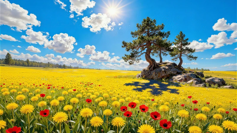
Also recommended: WallpaperSense’s new "Chinese Style Autumn Landscape 8K Ultra HD Wallpaper Pack"—51 high-definition wallpapers capturing Eastern autumn charm, featuring ink-washed lotus ponds, maple-lined trails, temple sunsets, and misty mountain pavilions—all native 8K resolution, compatible with desktops and mobile devices, no cropping needed. These aren’t symbolic Chinese-style collages—they’re contemporary visual translations of traditional artistic conception, preserving breath and time within each pixel. Perfect for creatives seeking calm strength amidst fast-paced work.
Related Articles
From Distracted to Focused in One Wallpaper Swap: How Minimalist Flower Fields Transformed My Study Screen (and Why Yours Might Too)
Staring at a cluttered desktop while trying to study? We compare real student se...
Why Your Meditation App Needs a Miyazaki Night Scene Behind It — The Quiet Rise of Mindful Wallpaper Design
More people are choosing intentional wallpapers not just to decorate screens—but...
Three Minutes to Calm: How to Choose a Lunch-Break Wallpaper That Feels Like Stepping Into a Chinese Autumn Orchard
You’ve got 20 minutes. Your eyes are tired. Your brain feels like static. Here’s...