你的日历变了,桌面也该变:如何挑选一款随心情起伏的季节壁纸包(尤其适合喜欢宫崎骏田野风光的人)
你在四月初打开笔记本,总觉得哪里不对劲——屏幕还停在冬天的冰霜,窗外却已是迎春花开。这份指南帮你挑到一套贴合实时自然、情绪节奏和能量变化的季节壁纸包,无需猜测,直接上手。
你三月中旬瞥一眼电脑屏幕,突然觉得不对劲:屏幕上还是覆盖着雪的松树,窗外却已开满连翘花,鸟叫声此起彼伏。
这种微妙的错位并不简单。桌面背景是你一天工作的第一层视觉入口——如果它和窗外正在发生的季节变化(以及你内心的节奏)不一致,就会悄悄削弱你的专注力、平静感和生活节律。
季节性壁纸不是为了装饰,而是为了契合:日历时间与身体感受的同步,光线变化与精神状态的呼应,自然的细微过渡与你情绪的流动。
下面教你如何选择并轮换一套像呼吸一样顺应四季的壁纸包,而不是对抗它。
第一步:根据你的情绪能量来标记日历,不只是天气
别管天气预报怎么说。真正重要的是你如何度过一年:晚春时是否感觉敏锐开阔?秋分后是否变得缓慢沉静?寒冬里是否焦躁不安,或者反而更踏实?
每个月试着记录三件事:你当下的主要能量状态(比如“清醒但散乱”、“平静清晰”、“疲惫但有创造力”),一个你注意到的本地自然信号(鸟儿归来、树叶变厚、草上结霜),以及你在屏幕前能集中注意力多久。
你会逐渐发现规律:也许你的专注力在早上七点后阳光拉长时达到顶峰,或者只有看到蒲公英才放松肩膀。这就是你的个人季节节奏——不是节气日期,而是真实的体验。
试试这个方法:翻出去年三月、六月、九月和十二月的照片。哪个月的户外照片让你忍不住深呼吸?那就是你的锚定季节——选第一个季节壁纸包时就从这里开始。
第二步:匹配壁纸氛围,而不是只看颜值
春天的壁纸不该只是展示花朵,而要引导柔和的关注。想象轻柔的动作:风吹动高草、樱花模糊飘过画面、露珠在蛛网上闪亮。安静没问题,但静态的死寂(比如冻结湖面的照片)在春天会让人感到情绪空洞。
夏天需要温暖却不刺眼。避免饱和度太高的黄色或强烈阳光造成的眩光,长时间盯着容易疲劳。找些层次感:阳光森林里的层层绿意、薄雾中泛光的水面、黄昏田野中的色彩丰富却不张扬。
秋天靠质感和过渡取胜。好的秋日壁纸要有叠加的光影:穿过稀疏落叶的光束、冷土上升起的薄雾、暖色温柔地落在冷影之上。它应该让人踏实,而不是怀旧或忧郁。
冬天讲究安静的存在感,不是空白。避开纯白虚空或冰冷单色。寻找细微的生命痕迹:小屋烟囱升起的烟、枝条托住柔和光线、淡蓝天空下积雪的山坡。氛围是低语般的宁静,不是空洞。
- 春季:柔焦 + 暗示动感(微风、花开、光影变化)
- 夏季:温暖 + 立体深度(不是扁平明亮)
- 秋季:多层光影 + 触感纹理(木纹、苔藓、落叶)
- 冬季:安静存在 + 温和对比(不突兀也不冰冷)
第三步:优先考虑视觉呼吸感——尤其适合长时间盯屏
如果你每天用电脑超过六小时,壁纸不是背景,而是环境基础设施。高对比边缘、重复杂乱图案或混乱构图会让你的周边视觉不断调整,这种微小努力累积起来会造成眼疲劳、注意力涣散,甚至下午三点就开始烦躁。
注意这些呼吸感特征:
- 一个清晰的单一自然焦点(孤树、远山、安静的小屋)
- 软绵绵的地平线——没有生硬的天空与地面分割线
- 天空或田野色调渐变自然,不要颜色突变
- 焦点周围留白充足——角落无杂物,前景无干扰元素
试一下:设置一张壁纸做30秒测试(回一封邮件、刷个新闻)。观察眼睛去哪儿停留。舒服吗?还是会跳动、搜索、频繁眨眼?
再试试:把两张壁纸并排打开——一张热闹,一张宁静。每张看20秒。哪一张让你目光更柔和,而不是更锐利?
第四步:建立无缝轮换机制——不用费脑
最难的不是找到好图片,而是记得什么时候换,以及哪个最贴合当下。
用三个简单系统让轮换轻松完成:
- 文件夹命名按季节+情绪,不只是主题:
春季-草地、夏季-湖泊、秋季-山谷、冬季-山丘。这样一眼就知道情绪基调——不会猜“湖边07”到底是夏天还是秋天。 - 以真实世界线索为切换依据,而非日历日期:设提醒标题为 “当本地樱花盛开时换成春季田野”(查本地花期或看看窗外)。这让你的变化扎根于实际体验,而不是随意日期。
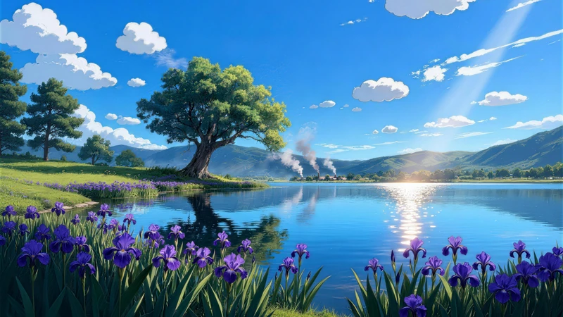
- 先从一套完整统一的包入手——比如 宫崎骏风格田野风景8K桌面壁纸包。这套包含32张图,跨季流畅过渡,始终保留柔和光线与田园和谐,毫无突兀色调跳跃。你可以拥有春日草地、夏日湖泊、秋日山谷、冬日山丘——全部采用同一治愈美学。无需混搭不同风格,也不会陷入选择困难。
这个包正是为此设计:一种缓慢、有意的视觉节奏。每张图都留有空间、温度和细腻细节——无论你在二月处理表格,还是十月起草提案。而且适配8K和超宽屏显示,每个像素都在支持平静,而非杂乱。
你不需要四个不同的包,只需要一个能陪你成长的——就像季节本身一样。
季节性壁纸不是追逐潮流或完美审美,而是尊重身体节奏,信任眼睛对休息的需求,让你的屏幕反映此刻窗外的真实世界,也映照内心的感受。当桌面与日历和心情一致,专注加深,平静降临,工作日真正开始了——应季而生。探索更多自然疗愈系选项,请访问我们的 浏览壁纸 页面。
Recommended Wallpaper Packs
Related Articles
枫韵山息:中式水墨壁纸如何让思绪如峰顶薄雾般升起
困在创意瓶颈?不是你的方法问题,而是你的像素。了解如何通过有意选择壁纸——特别是像[中式枫叶与山景8K超高清壁纸套装](/packs/chinese-style...
你的屏幕是压力触发器——动漫风景壁纸60秒内安抚神经系统
整天盯着屏幕?了解精心挑选的自然壁纸——尤其是柔焦动漫风景——如何减轻精神疲劳、缓解眼疲劳,并温和重置神经系统。无需应用,无需计时,只需一次明智更换。
三步放松:如何选择像宫崎骏世界一样的治愈系壁纸
连续开完Zoom会议后关上电脑——屏幕却仍像待办事项列表的延伸。这份三步指南教你如何选出能传达安全感、柔软感和静谧感的放松壁纸,就像走进[日式风景8K壁纸包](...